You want 200 lb on the bar. The bar is 45, so 155 is left, so 77.5 goes on each side, so you need a 45, a 25, a 5 and a 2.5. That is the arithmetic every lifter does badly, between sets, with cold hands, at arm's length, while the rest period gets shorter.
Barlog answers it. The interesting part is not the math, which is a small solver. It is the input: how you tell the app what weight you want, on a phone, with one hand, while standing at a rack.
Why not the obvious controls
I started from the situation rather than the screen. The phone is on the floor, propped on a bench, or held in the hand that is not chalked. The user is not looking closely and is not aiming carefully.
That rules out most of the standard vocabulary:
- A numeric keypad is exact and slow. Three or four taps and a dismiss, each one a precise target, to enter a number you will change again in ninety seconds.
- A stepper is fine for 185 to 190 and miserable for 95 to 315.
- A conventional slider puts a thumb roughly 40 pt tall in a screen roughly 850 pt tall. Ninety five percent of the display is inert, and the one part that responds is the part hardest to hit without looking.
Every one of those asks the user to be accurate. The situation does not allow accuracy. So the control had to be the opposite: the largest possible target, hit anywhere, dragged in the one direction a hand naturally moves.
The mapping
The slider is the screen. Value maps to fill height: 0 at the bottom edge, 800 lb at the top, filled yellow from the bottom to wherever you stopped. The boundary between filled and unfilled is the value, and the number sits on that boundary rather than in a fixed corner, so the thing you read and the thing you moved are the same object.
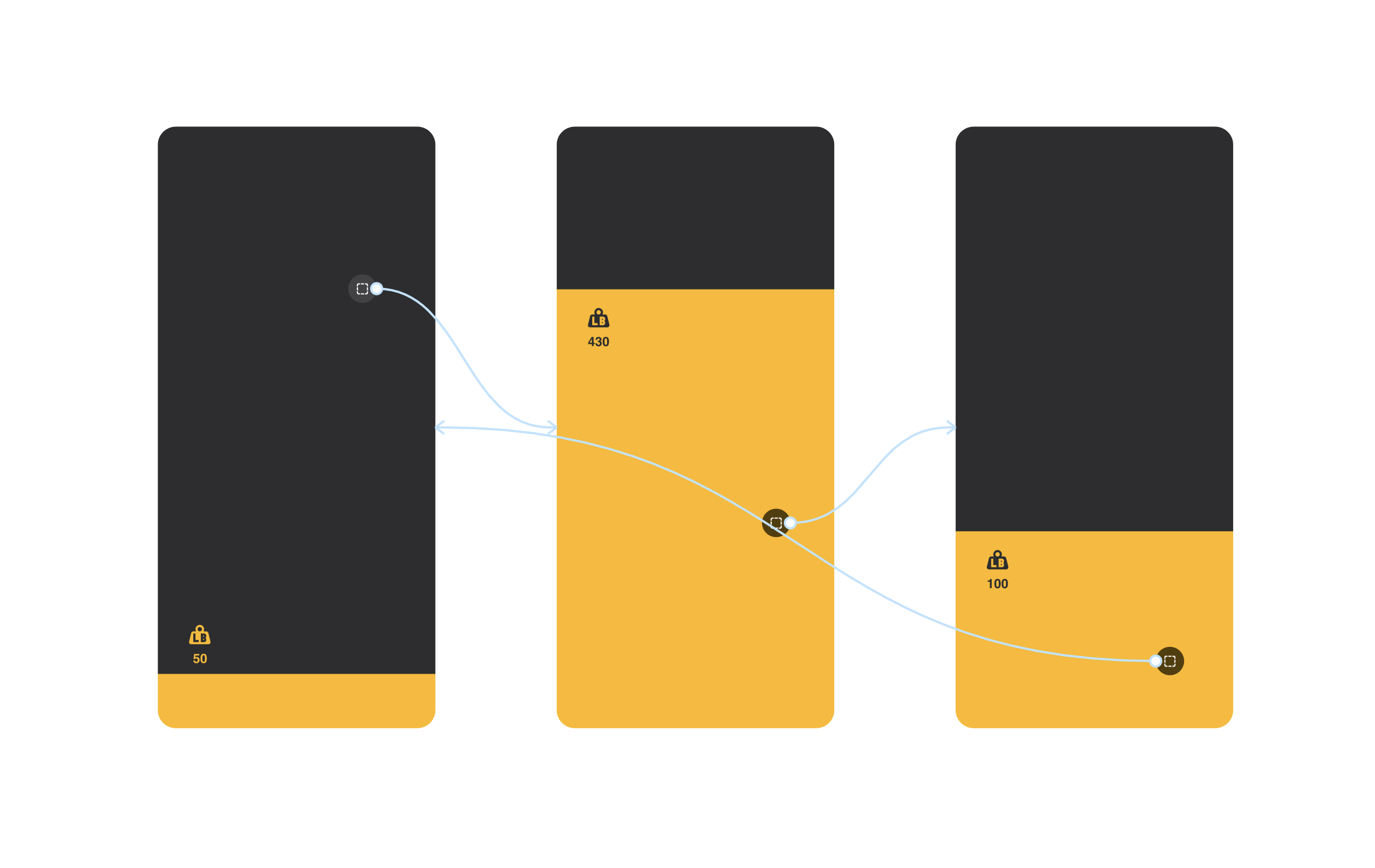
Fill height is the value. The number rides the boundary.
There is no thumb, so there is no target. Touch down anywhere and drag.
Killing the coach marks
The first build opened with coach marks: an overlay pointing up, telling you to swipe. I cut them.
The reasoning was that a coach mark is usually a diagnosis, not a fix. If a control needs a caption explaining how to touch it, the affordance is missing from the control, and the overlay is a note taped over the gap. It also charges everyone, on every fresh install, for a problem that only exists in the first three seconds of the first session.
The replacement was to make the control resemble something that is already understood to have positions along it. A ruler: tick marks up the left edge, longer and labeled every 50 lb, running the full height.

The ruler edge, which replaced the coach marks.
A ruler communicates "this axis carries values and you move along it" without a sentence, and it is permanent, so it keeps working on the fortieth session when the coach mark would have been long dismissed.
The honest cost: this trades an explicit instruction for an inference. If someone opens the app and never touches the screen, nothing now tells them what to do. I took that trade because the failure is instantly recoverable (any touch anywhere reveals the whole mechanic) while the coach mark charged a modal interruption to every user, forever, to prevent it.
Coarse input is fine when the output is discrete
The obvious objection to a full-screen drag is precision. Spreading 800 lb across about 850 pt of travel gives roughly one pound per point, which sounds acceptable until you remember a fingertip contact patch is eight to ten points wide. You can land near 200. You cannot reliably land on 202.5.
That turns out not to matter, because the set of weights you can actually build is discrete. With 2.5 lb as the smallest plate and plates loading in pairs, a 45 lb bar can only reach values 5 lb apart. There is no 202.5 to miss. The gesture only has to get within half a plate increment of the intent, and a coarse drag does that comfortably.
This is the part I would defend hardest: precision in the input is only worth paying for when the output space is continuous. Here it is not, so the pixels are better spent on target size.
The answer is text first
The plate rendering in the middle of the screen is the illustration. The answer is the rail on the right: Load 1 × 45 lb, 1 × 25 lb, 1 × 5 lb, 1 × 2.5 lb, Plates Per Side, with the bar weight pinned at the bottom.
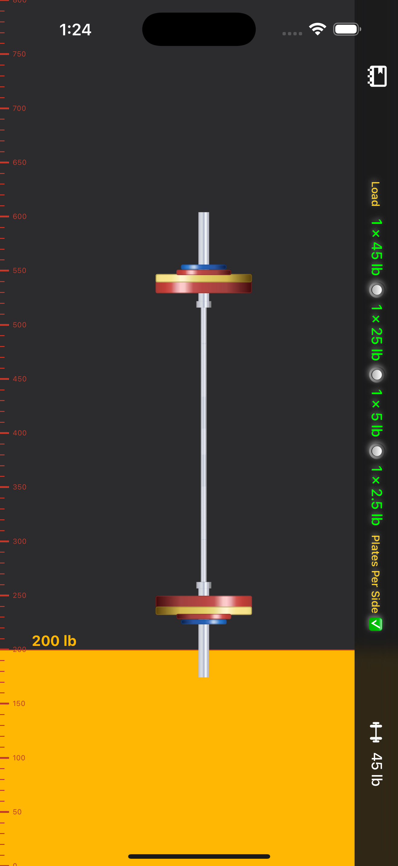
200 lb on a 45 lb bar: 45 + 25 + 5 + 2.5 per side.
I want to be precise about the accessibility claim here, because the original version of this writeup overstated it. Having the result available as text is not the same as the app being accessible. It means the primary output is a string rather than a picture, which is the right foundation and nothing more. I have not run a full VoiceOver audit, and the piece I would test first is exactly the piece the design makes hardest: announcing a continuously changing value during a drag that covers the entire screen, without flooding the user.
Where this breaks
Four real problems, in order of how much they bother me:
1. It collides with the OS. Dragging near the bottom edge is the same gesture as the home indicator swipe. The bottom of the screen is the low weight range: the empty bar, the warmup sets. That is not an edge case, it is the range people touch most.
2. It assumes the full height. Split view, a compact window, or an unusually short screen all compress the track, and resolution per point drops with it. The design has one input dimension and gives all of it away to the window manager.
3. A screen that is entirely one control has nowhere to put a second one. Bar weight and lb/kg had to live off the main surface. That is a direct, permanent tax on every future feature, and it will get worse before it gets better.
4. None of this is measured. Barlog collects no usage data, on purpose. That is the right call for a gym calculator that has no reason to know anything about you, and it means I gave up the evidence that would settle any of the arguments above. Every claim in this writeup is a design argument, not a finding. I would rather say that plainly than dress up a preference as a result.
Where it landed
Barlog shipped on iOS in December 2024, built in React Native on top of rn-vertical-slider by sacmii. Credit where it is due: Bar Is Loaded by Danny Li had already solved the same arithmetic with a conventional layout. What I wanted to change was not the calculation, it was the number of taps between wanting a number and seeing it.
The full-screen drag survived contact with the App Store. The coach marks did not, and I think that was the better of the two decisions.
Try the app, or step through the original prototype below.